Home Decor
Art That Makes a Room Feel Bigger: A Simple Buyer's Guide
The right art can visually expand your space. Learn which types of art create the illusion of more space and how to choose pieces that make any room feel larger.
8 min read

Statement walls create dramatic focal points, but common mistakes can ruin the effect. Learn how to create stunning statement walls that enhance rather than overwhelm your space.
How to Make a Statement Wall Without Making a Mistake
A statement wall with large art can transform a room. But get it wrong, and you've created an expensive mistake. Get it right, and you've created a stunning focal point. Here's how to make a statement wall that works.
A statement wall:
The goal: One wall, one piece, maximum impact.
The problem: Art that's too small (gets lost) or too large (overwhelms)
The fix: Use 50-80% of wall width rule. For statement walls, aim for 70-80% for maximum impact.
Example: 12-foot wall → 84-96 inch art for statement effect.
The problem: Busy, cluttered scenes that overwhelm at large scale
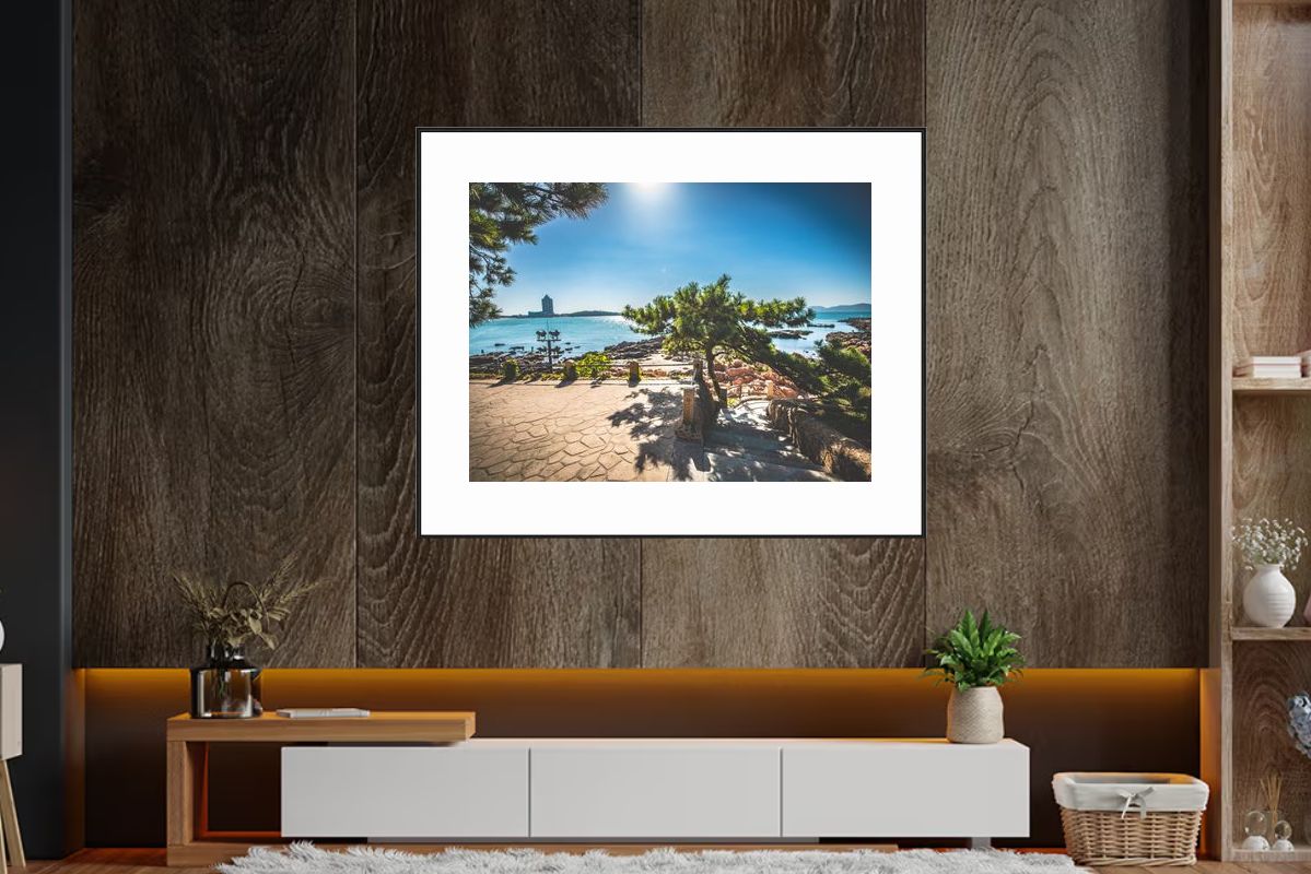
The fix: Choose simple, uncluttered compositions. Horizons, minimalist scenes, atmospheric landscapes work best.
Avoid: Complex, detailed, busy scenes.
The problem: Colors that clash with room or are too intense
The fix: Use neutral palettes or limited colors (1-2 max). Match or complement room colors.
Avoid: Rainbow palettes, high saturation, clashing colors.
The problem: Art positioned awkwardly—off-center, too high, too low
The fix: Center on wall, eye level (57-60 inches), or slightly higher for drama. Leave breathing room.
The problem: Too many other elements on the wall or in room
The fix: Let the art be the star. Remove or minimize competing elements. Keep it simple.
Best walls for statements:
Avoid: Walls with lots of doors, windows, or competing elements.
For statement walls:
Example: 12-foot wall (144 inches)
Why 70-80%: Creates strong presence without overwhelming. Maximum impact range.
Best subjects for statements:
Avoid: Busy, complex, cluttered scenes.
Best color approaches:
Avoid: Multiple colors, high saturation, clashing tones.
Placement rules:
Result: Perfectly positioned statement piece.
Wall: 15-foot wall behind sofa Art: 120-inch wide minimalist horizon Colors: Monochrome (black and white) Placement: Centered, eye level, 12 inches above sofa Lighting: Track lighting highlights art
Result: Dramatic focal point, sophisticated, impressive.
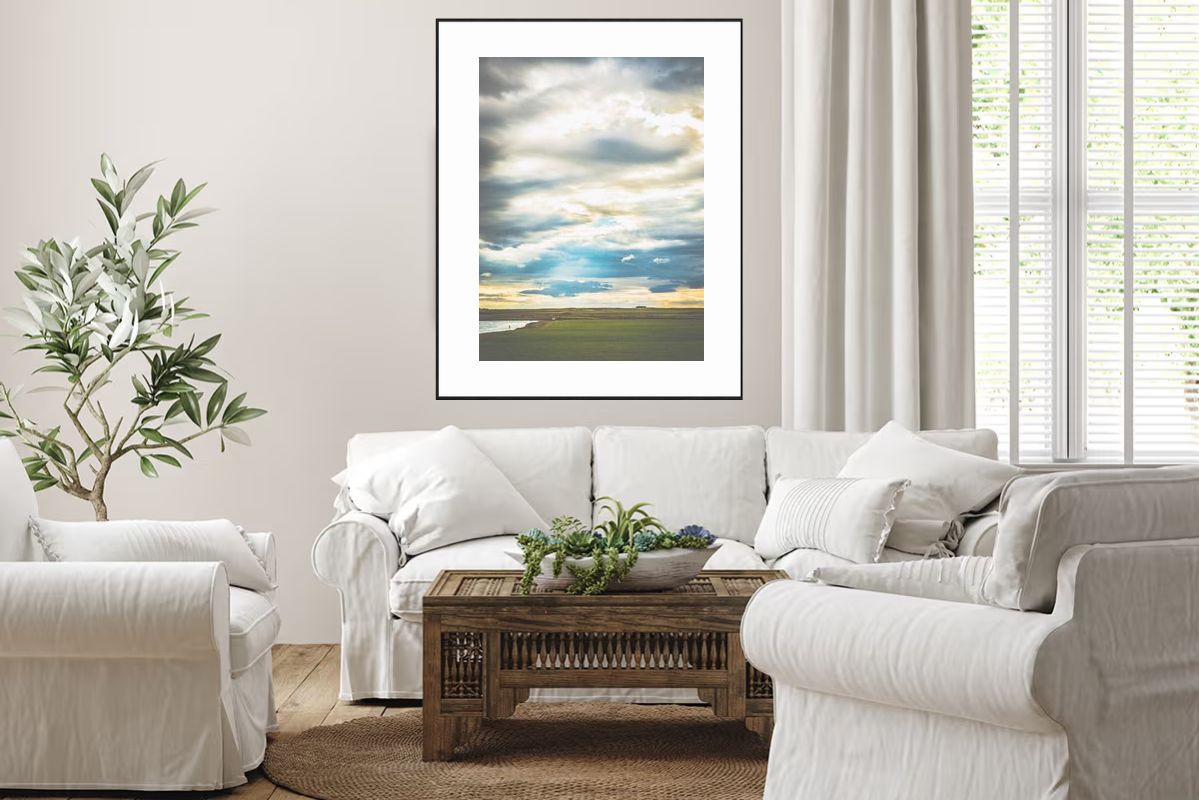
Wall: 12-foot wall above bed Art: 96-inch wide calming water scene Colors: Soft blues and grays Placement: Centered, 8 inches above headboard Lighting: Soft, indirect lighting
Result: Peaceful focal point, restful atmosphere, beautiful statement.
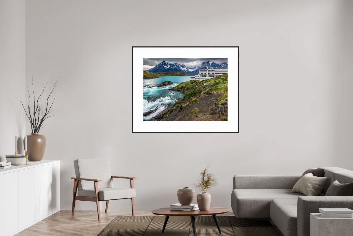
Wall: 10-foot wall opposite front door Art: 84-inch wide atmospheric mountain scene Colors: Muted grays and blues Placement: Centered, eye level Lighting: Natural and accent lighting
Result: Impressive first impression, welcoming, sophisticated.
For statement walls:
The rule: One focal point, one statement, one star.
What works:
What doesn't work:
Considerations:
Best options:
Important: Statement art needs proper lighting to be appreciated.
Answer: For true statement walls, no. One piece, one statement. If you want multiple pieces, create a gallery wall instead.
Answer: Choose wall without windows, or position art to work with windows. Don't fight the architecture.
Answer: Eye level (57-60 inches) for standard. Can go slightly higher (up to 66 inches) for dramatic effect in high ceilings.
Answer: Furniture should complement, not compete. Keep it minimal and simple. Let art be the star.
Making a statement wall without mistakes:
Avoid:
Remember: A statement wall is about one thing: making a strong, positive statement with one piece of art. Keep it simple, keep it large, keep it focused. When done right, a statement wall transforms a room and creates a stunning focal point you'll love for years.
Your statement wall, your impact, your confidence.
The right art can visually expand your space. Learn which types of art create the illusion of more space and how to choose pieces that make any room feel larger.
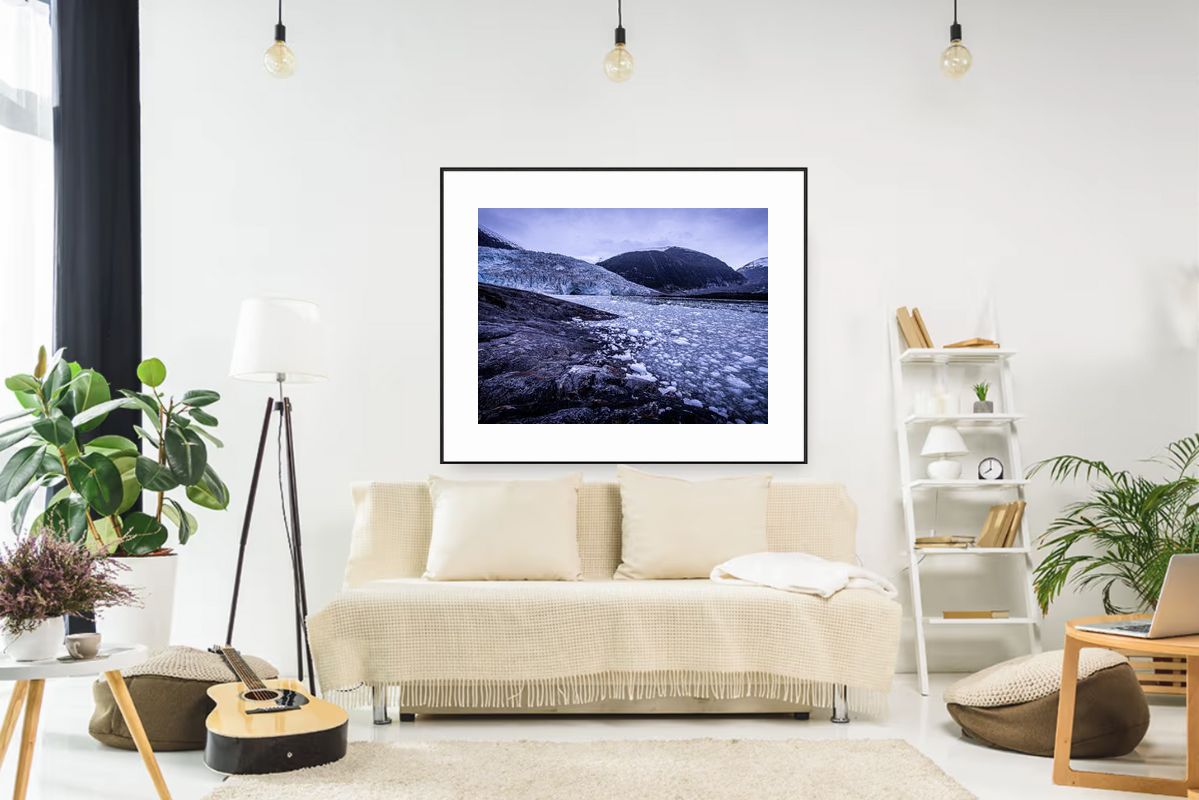
Glacier photography has unique qualities that make it perfect for modern interiors. Discover why these icy landscapes create such stunning focal points in contemporary spaces.
The right art can make your space feel larger and more peaceful. Learn the specific characteristics that create a sense of space and stillness in any room.