Your room feels small. You can't change the square footage, but you can change how it feels. The right art can make any room feel bigger. Here's your simple guide to choosing art that expands your space visually.
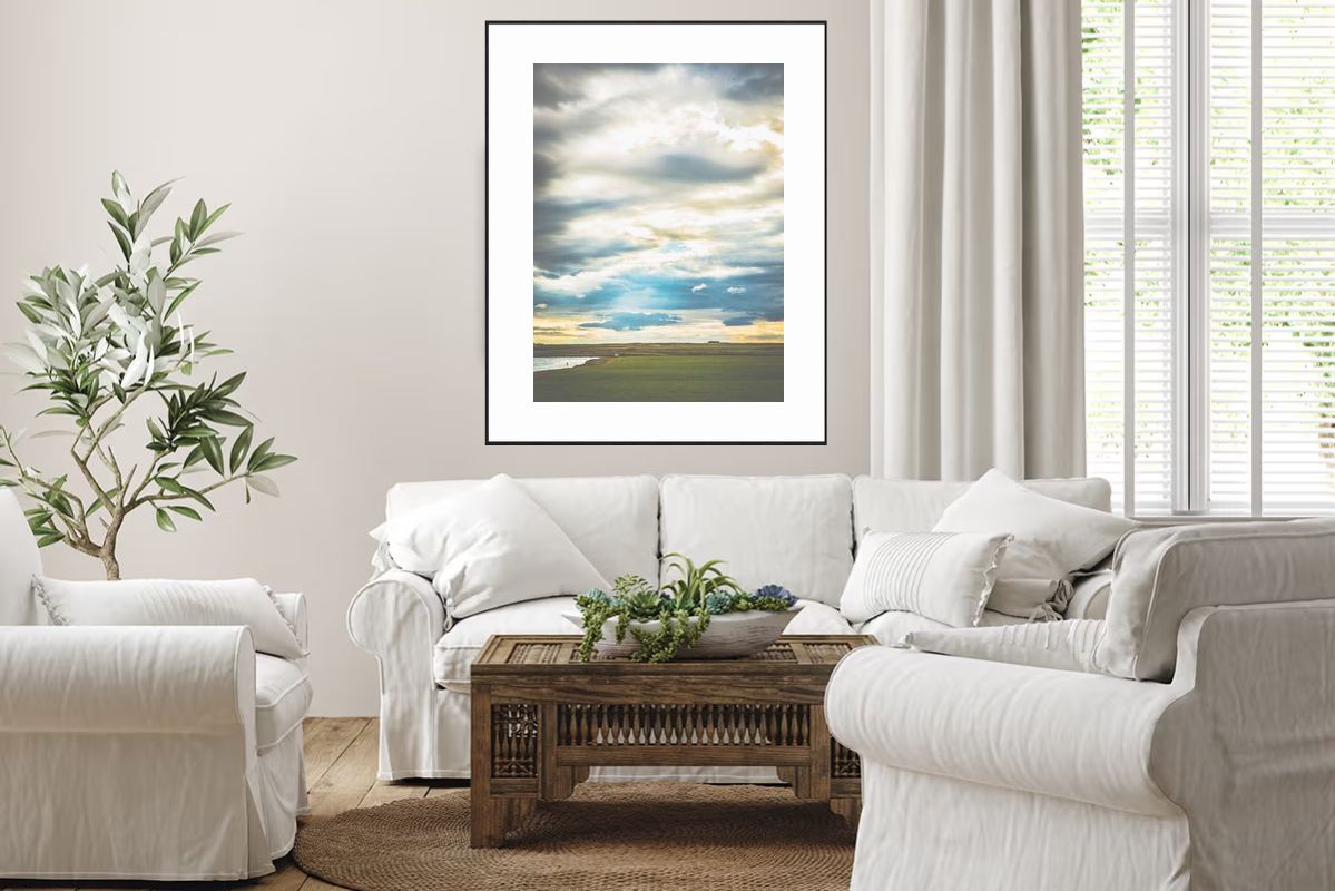
The vast canopy of clouds and expansive sky creates an illusion of depth and opens up walls visually, making rooms feel bigger.
Art can make rooms feel bigger by:
- Creating illusion of depth
- Opening up walls visually
- Providing visual breathing room
- Drawing eye into distance
- Creating sense of expansiveness
The principle: Art that suggests space makes space feel larger.
The vast salt pan with minimal elements creates an open scene that makes the room feel open and less cluttered.
Art affects perception:
- Open scenes → room feels open
- Depth and distance → room feels deeper
- Lots of sky/space → room feels larger
- Horizontal emphasis → room feels wider
- Simple compositions → room feels less cluttered
The effect: Perception becomes reality. Room feels bigger.
The panoramic sweep with vast open space creates visual breathing room and makes walls feel open and expansive.
What it is: Large areas of sky, water, or open landscape
Why it works:
- Creates visual breathing room
- Makes walls feel open
- Provides sense of expansiveness
- Reduces visual clutter
- Feels spacious
Best examples:
- Expansive sky (70%+ of image)
- Calm water with lots of surface
- Open landscapes with minimal elements
- Simple horizons with lots of space
The rule: More empty space in art = more sense of space in room.
The receding horizon with distant mountains creates an illusion of depth, making the room feel deeper and more expansive.
What it is: Scenes that show distance, receding elements, vanishing points
Why it works:
- Creates illusion of depth
- Makes room feel deeper
- Draws eye into distance
- Suggests space beyond
- Feels expansive
Best examples:
- Receding horizons
- Distant mountains
- Vanishing points
- Atmospheric perspective
- Scenes that pull eye into distance
The rule: Depth in art = depth in room perception.
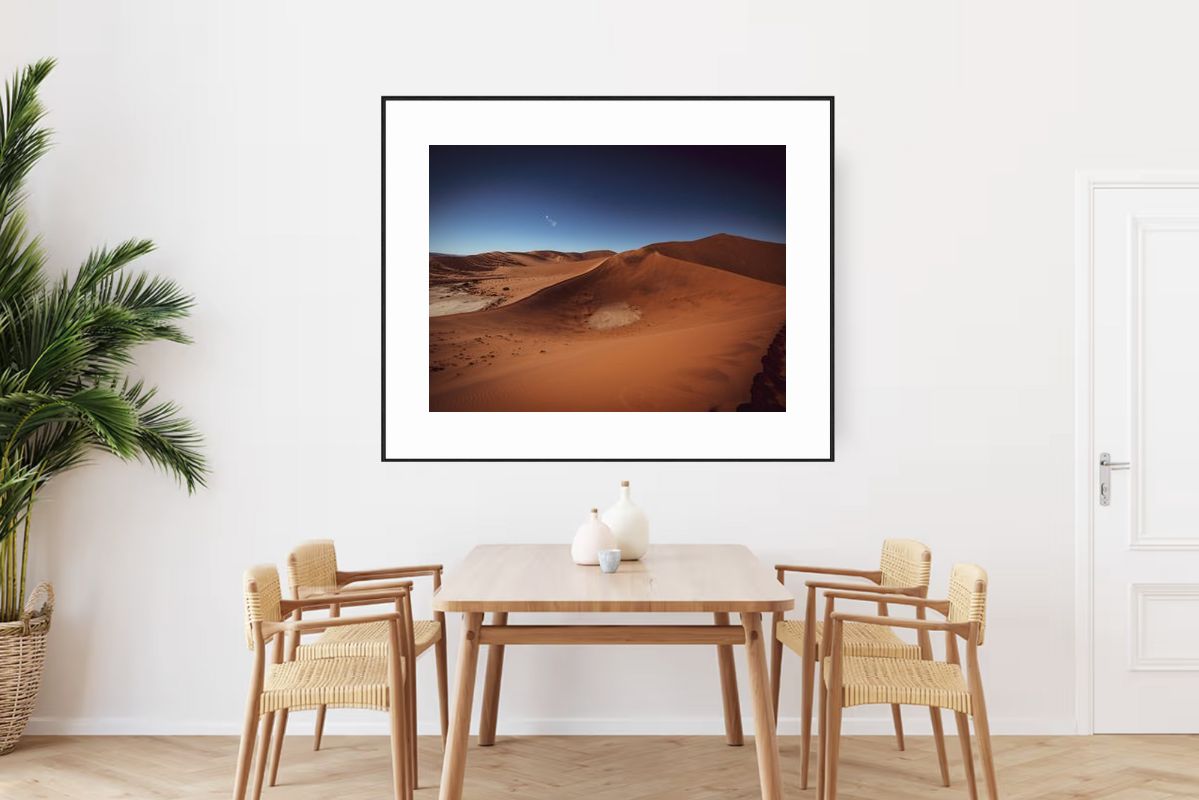
The wide, horizontal composition of the dune creates a sense of width, making the room feel wider and more open.
What it is: Wide, horizontal compositions (landscape orientation)
Why it works:
- Creates sense of width
- Makes room feel wider
- Opens up walls
- Feels stable and open
- Promotes sense of space
Best examples:
- Wide horizons
- Calm water scenes
- Expansive landscapes
- Open vistas
- Horizontal compositions
The rule: Horizontal art = wider feeling room.
The minimal elements and clean composition reduce visual clutter, making the room feel less cramped and more spacious.
What it is: Minimal elements, clean lines, lots of space
Why it works:
- Reduces visual clutter
- Creates sense of clarity
- Feels open, not busy
- Provides visual rest
- Makes room feel less cramped
Best examples:
- Simple horizon lines
- Minimalist landscapes
- Clean water scenes
- Uncluttered vistas
- Minimal elements
The rule: Simpler art = less cluttered feeling room.
The light blues and soft tones feel airy and light, creating a sense of openness without weighing down the space.
What it is: Soft, light tones, not dark or heavy
Why it works:
- Feels light and airy
- Doesn't weigh down space
- Creates sense of openness
- Reflects light
- Feels spacious
Best examples:
- Light blues and grays
- Soft whites
- Gentle pastels
- Muted, light tones
- Airy color palettes
The rule: Light colors = light feeling room.
Why they don't work:
- Create visual noise
- Make room feel cramped
- Overwhelm space
- Reduce sense of openness
- Feel cluttered
Avoid: Complex, detailed, busy compositions.
Why they don't work:
- Weigh down space
- Make room feel smaller
- Absorb light
- Feel constraining
- Reduce sense of openness
Avoid: Dark, saturated, heavy colors.
Why it doesn't work:
- Feels constraining
- Doesn't create width
- Makes room feel taller, not larger
- Doesn't open up walls
- Feels narrow
Avoid: Tall, vertical compositions (unless you want height, not width).
Why it doesn't work:
- Doesn't fill space
- Gets lost on wall
- Doesn't create impact
- Makes room feel smaller
- Lacks presence
Avoid: Art that's too small for space.
This versatile piece works for creating width, depth, and overall space, helping you identify your expansion goal.
What do you need:
- More width? (room feels narrow)
- More depth? (room feels shallow)
- More overall space? (room feels cramped)
- Less clutter? (room feels busy)
Clarify: Understanding goal helps choose right art.
This piece exemplifies space-creating characteristics: negative space, depth, horizontal emphasis, simple composition, and light colors.
Check for:
- Lots of negative space (sky, water, openness)
- Depth and perspective (distance, receding)
- Horizontal emphasis (wide, not tall)
- Simple composition (uncluttered, minimal)
- Light colors (soft, airy tones)
The more, the better: More characteristics = more sense of space.
For expanding space:
- Go large: Larger art creates more impact
- Use 50-80% rule: For walls, 60-75% for furniture
- Fill space: Large art with space characteristics amplifies effect
Why: Big art with space-creating qualities maximizes the effect.
Best placement:
- Main wall (focal point)
- Eye level or slightly above
- Centered, with breathing room
- Good lighting (enhances effect)
- Minimal competing elements
Result: Art becomes space-expanding focal point.
Challenge: 10x14 room feels narrow
Solution: Large horizontal horizon (60 inches wide)
- Lots of sky (75% of image)
- Simple composition
- Light blues and grays
- Horizontal emphasis
- Placed on long wall
Result: Room feels wider, more open, less narrow.
Challenge: Bedroom feels shallow, no depth
Solution: Large landscape with depth (54 inches wide)
- Receding horizon
- Atmospheric perspective
- Distant elements
- Lots of sky
- Horizontal composition
Result: Room feels deeper, more spacious, less shallow.
Challenge: Small office feels cramped
Solution: Large minimalist landscape (48 inches wide)
- Expansive sky and land
- Simple, uncluttered
- Light, airy colors
- Horizontal emphasis
- Lots of negative space
Result: Office feels more spacious, less cramped, more open.
Small rooms (under 100 sq ft):
- Art: 36-48 inches wide
- Use 50-60% of wall width
- Horizontal emphasis
- Lots of negative space
- Light colors
Why: Large enough to impact, not so large it overwhelms.
Medium rooms (100-200 sq ft):
- Art: 48-60 inches wide
- Use 60-70% of wall width
- Horizontal emphasis
- Lots of negative space
- Light colors
Why: Larger art creates more impact in medium spaces.
Large rooms (200+ sq ft):
- Art: 60-96 inches wide
- Use 70-80% of wall width
- Horizontal emphasis
- Lots of negative space
- Light colors
Why: Large art fills large spaces, creates maximum impact.
Problem: Small art doesn't create sense of space
Fix: Go larger. Use 50-80% rule. Large art with space characteristics works best.
Problem: Cluttered art makes room feel cramped
Fix: Choose simple, uncluttered compositions with lots of negative space.
Problem: Vertical art doesn't create width
Fix: Choose horizontal compositions. They create width and openness.
Problem: Dark colors weigh down space
Fix: Choose light, airy colors. They create sense of openness.
Problem: Constraining subjects don't create space
Fix: Choose open, expansive subjects. Horizons, water, open landscapes.
Art that makes rooms feel bigger:
- Has lots of negative space: Sky, water, openness (70%+ ideal)
- Shows depth: Perspective, distance, receding elements
- Emphasizes horizontal: Wide, not tall compositions
- Uses simple compositions: Uncluttered, minimal elements
- Features light colors: Soft, airy tones, not dark
- Is large enough: 50-80% of wall width, 60-75% of furniture width
What to avoid:
- Busy, cluttered scenes
- Dark, heavy colors
- Vertical emphasis
- Small art
- Constraining subjects
How to choose:
- Identify your goal (width, depth, overall space, less clutter)
- Look for space: creating characteristics (negative space, depth, horizontal, simple, light)
- Choose appropriate size (larger is better, use rules)
- Place prominently (focal point, eye level, breathing room)
Remember: You can't change square footage, but you can change how space feels. Art with lots of negative space, depth, horizontal emphasis, simple compositions, and light colors makes any room feel bigger. Choose wisely, go large, place well. Your room will feel more spacious.
Your art, your space, your expansion.