Logo
Home Decor
8 min read
Ning Ma

Is Vertical or Horizontal Art Better for Hallways?

Hallways present unique challenges for art placement. Discover whether vertical or horizontal artwork works best in narrow spaces and how to create visual flow.

#hallway art#interior design#art placement#vertical art#horizontal art#home decor
Is Vertical or Horizontal Art Better for Hallways?

Is Vertical or Horizontal Art Better for Hallways?

Is Vertical or Horizontal Art Better for Hallways?

Hallways are transitional spaces—they connect rooms and guide movement through your home. But they're also opportunities to display art and create visual interest. The question is: vertical or horizontal? The answer depends on your hallway's dimensions, traffic patterns, and your goals for the space.

Understanding Hallway Spaces

Typical Hallway Characteristics

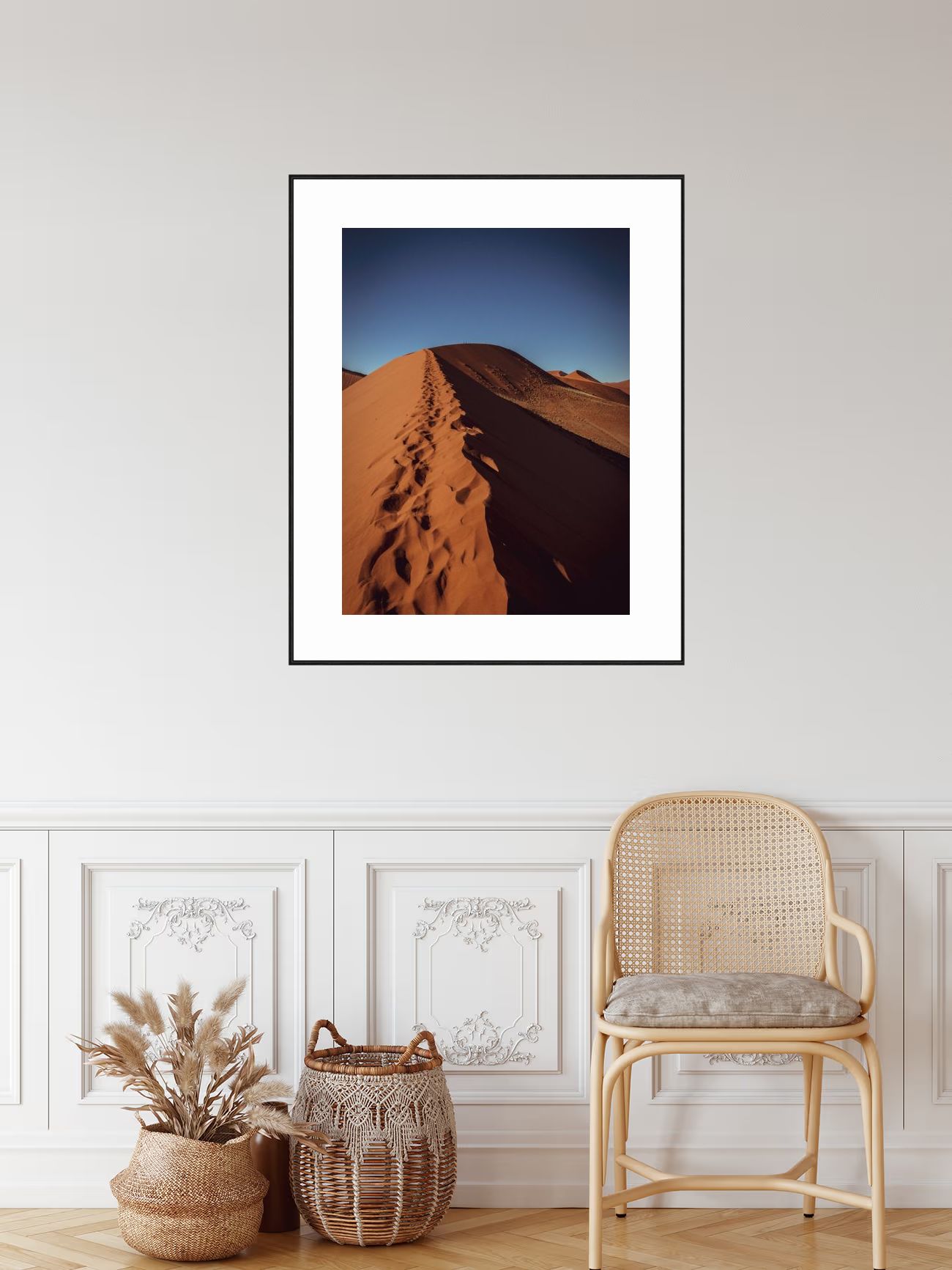
This award-winning vertical piece from Africa demonstrates perfect hallway fit—the portrait orientation works beautifully in narrow hallways with limited wall space.

Most hallways feature:

  • Narrow width: 3-5 feet wide typically
  • Long length: Often much longer than wide
  • High traffic: People moving through regularly
  • Limited wall space: Narrow walls on either side
  • Variable lighting: Often darker than main rooms
  • Transitional function: Connects other spaces

The Challenge

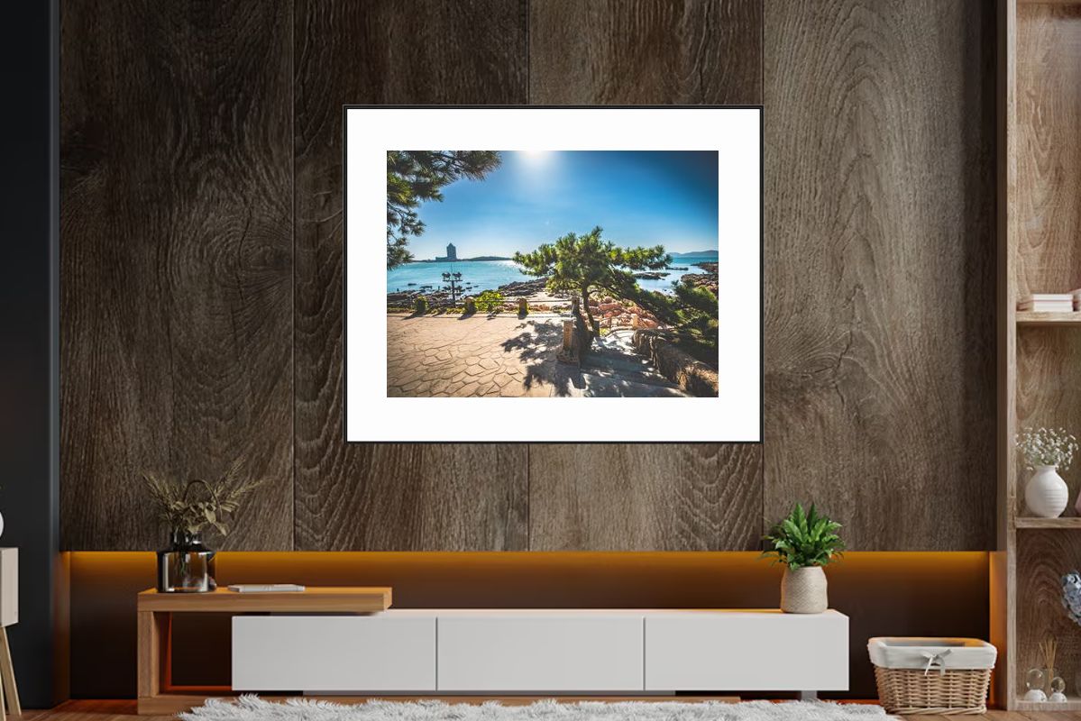
This best-selling horizontal piece from Africa addresses hallway challenges—the wide format creates sense of width in narrow spaces while fitting long hallway walls.

Hallways present unique challenges:

  • Narrow walls: Limited horizontal space
  • Long spaces: Need to create visual flow
  • Movement: Art viewed while walking
  • Lighting: Often insufficient natural light
  • Scale: Hard to get proportions right

Vertical Art in Hallways

When Vertical Works

This award-winning vertical piece from Africa demonstrates when vertical works—fits narrow walls perfectly, creates height, and takes advantage of high ceilings in hallways.

Vertical art is ideal when:

  • Hallway is narrow: Vertical pieces fit narrow walls
  • You want height: Creates sense of vertical space
  • High ceilings: Takes advantage of ceiling height
  • Creating rhythm: Multiple vertical pieces create flow
  • Limited width: Vertical fits better than horizontal

Advantages of Vertical

This award-winning vertical piece from Europe shows vertical advantages—space efficiency, visual flow, and height enhancement perfect for long, narrow hallways.

Space Efficiency:

  • Fits narrow walls perfectly
  • Doesn't require wide wall space
  • Makes use of vertical dimension
  • Can be larger without overwhelming

Visual Flow:

  • Guides eye upward
  • Creates sense of movement
  • Works with hallway's linear nature
  • Can create rhythm with multiple pieces

Height Enhancement:

  • Makes ceilings feel higher
  • Adds vertical interest
  • Balances long horizontal space
  • Creates architectural interest

Vertical Placement Strategies

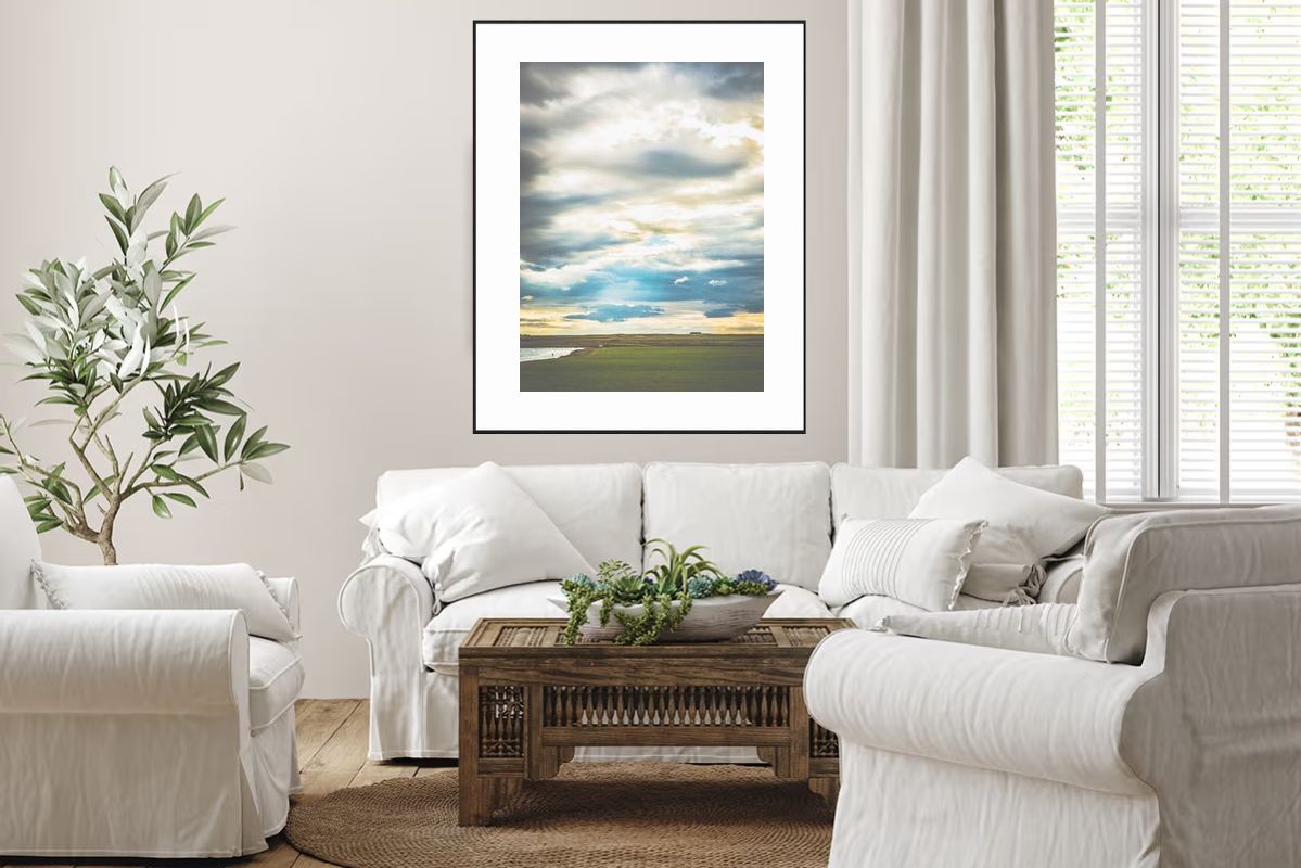
This best-selling vertical piece from South America demonstrates placement strategies—works beautifully as single large piece or in multiple vertical arrangements along hallway walls.

Single Large Piece:

  • One substantial vertical piece
  • Creates focal point
  • Works in wider hallways
  • Makes strong statement

Multiple Vertical Pieces:

  • 3-5 pieces arranged along hallway
  • Creates rhythm and flow
  • Guides movement through space
  • Maintains consistent spacing (2-4 feet apart)

Staggered Arrangement:

  • Alternating sides of hallway
  • Creates visual interest
  • Prevents monotony
  • Works in longer hallways

Horizontal Art in Hallways

When Horizontal Works

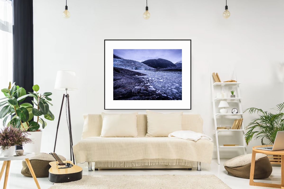
This award-winning horizontal piece from Africa demonstrates when horizontal works—the wide format creates width enhancement in wider hallways or at hallway ends.

Horizontal art can work when:

  • Wider hallways: 5+ feet wide
  • Short hallways: Not too long
  • Feature walls: Wider wall sections
  • Creating width: Makes narrow space feel wider
  • Single focal point: One large horizontal piece

Advantages of Horizontal

This award-winning horizontal piece from North America shows horizontal advantages—width enhancement, focal points, and balance perfect for wider hallways or feature walls.

Width Enhancement:

  • Makes narrow space feel wider
  • Creates sense of expansiveness
  • Balances long vertical space
  • Adds horizontal interest

Focal Points:

  • One large piece creates anchor
  • Works at hallway ends
  • Creates destination point
  • Draws eye forward

Natural Flow:

  • Matches direction of movement
  • Guides eye along hallway
  • Creates sense of progression
  • Works with linear space

Horizontal Placement Strategies

This best-selling horizontal piece from Asia demonstrates placement strategies—works beautifully as single large piece at hallway ends or in gallery arrangements.

Single Large Piece:

  • At end of hallway
  • Creates destination
  • Makes strong statement
  • Works in wider hallways

Series of Pieces:

  • Multiple horizontal pieces
  • Creates gallery effect
  • Maintains consistent height
  • Guides movement

Above Console or Table:

  • Horizontal art above furniture
  • Creates anchored focal point
  • Works in wider hallways
  • Adds function and beauty

Making the Decision

This award-winning square piece from South America demonstrates decision-making—the balanced square format works when hallway width and length are similar, creating perfect proportions.

Measure Your Hallway

Width:

  • Narrow (3-4 feet): Vertical works better
  • Standard (4-5 feet): Either can work
  • Wide (5+ feet): Horizontal becomes more viable

Length:

  • Short (under 10 feet): Single piece, either orientation
  • Medium (10-20 feet): Multiple pieces, consider flow
  • Long (20+ feet): Multiple pieces, create rhythm

Ceiling Height:

  • Standard (8-9 feet): Either orientation
  • High (10+ feet): Vertical takes advantage
  • Low (under 8 feet): Horizontal may work better

Consider Traffic Patterns

High Traffic:

  • Vertical less likely to be bumped
  • Horizontal may interfere with movement
  • Consider placement height
  • Ensure proper clearance

Low Traffic:

  • More flexibility in placement
  • Can use either orientation
  • Can go larger
  • More decorative options

Lighting Considerations

Natural Light:

  • Consider window placement
  • Vertical can work with tall windows
  • Horizontal works with wide windows
  • Position to benefit from light

Artificial Light:

  • Track lighting works for either
  • Picture lights for individual pieces
  • Ensure even illumination
  • Consider light direction

Best Practices

Vertical Art Guidelines

Size:

  • 24-36 inches tall typical
  • Can go larger in high ceilings
  • Width: 12-18 inches
  • Proportion to wall space

Placement:

  • Center at eye level (57-60 inches)
  • Space 2-4 feet apart if multiple
  • Alternating sides creates interest
  • Maintain consistent height

Arrangement:

  • Odd numbers (3, 5) work best
  • Create visual rhythm
  • Guide eye through space
  • Maintain spacing consistency

Horizontal Art Guidelines

Size:

  • 24-36 inches wide typical
  • Height: 12-18 inches
  • Can go larger in wider hallways
  • Proportion to wall space

Placement:

  • Center at eye level
  • At end of hallway creates destination
  • Above furniture if present
  • Consider viewing distance

Arrangement:

  • Single piece often best
  • Multiple pieces at consistent height
  • Creates gallery effect
  • Guides movement forward

Special Considerations

Gallery Hallways

For gallery-style hallways:

  • Consistent orientation: All vertical or all horizontal
  • Uniform sizing: Same size pieces
  • Regular spacing: 2-4 feet apart
  • Cohesive theme: Related subject matter
  • Proper lighting: Even illumination throughout

Mixed Orientations

Mixing vertical and horizontal:

  • Can work: But requires careful planning
  • Maintain balance: Don't let one dominate
  • Create rhythm: Alternating pattern
  • Cohesive theme: Related artwork
  • Professional look: When done well

Narrow Hallways

For very narrow spaces (under 3 feet):

  • Vertical is usually better: Fits space
  • Smaller pieces: 18-24 inches tall
  • Higher placement: Avoid bumping
  • Minimal framing: Thin or frameless
  • Light colors: Make space feel larger

Common Mistakes

  1. Wrong Orientation: Horizontal in narrow hallway
  2. Too Large: Art that overwhelms space
  3. Poor Spacing: Pieces too close or too far
  4. Wrong Height: Too high or too low
  5. Inconsistent: Mixed sizes or styles
  6. Poor Lighting: Art that's hard to see

Conclusion

Vertical art is generally better for hallways because:

  • Fits narrow walls naturally
  • Creates sense of height
  • Guides eye upward
  • Works with hallway's linear nature
  • More space-efficient

Horizontal art can work when:

  • Hallway is wider (5+ feet)
  • Used as single focal point
  • Placed at hallway end
  • Above furniture or console
  • Creating specific effect

The best choice depends on your specific hallway dimensions, traffic patterns, and design goals. Measure your space, consider how it's used, and choose art that enhances rather than fights the hallway's natural characteristics. When in doubt, vertical is usually the safer, more effective choice for most hallways.

Explore the Deserts Collection

Browse our complete collection of deserts photography with 45 prints available.